Luminus
UX Case Study
Overview
In the turbulence of our 20s—career shifts, relocations, and personal growth—many young adults find their friendships fading under the weight of busy schedules. While social media offers constant updates, it rarely delivers true emotional connection.
LuminUs is a low-pressure digital platform designed to rekindle that warmth. Rooted in metaphors of fire and light, it helps close friends stay present in each other’s lives through simple, heartfelt exchanges—capturing the little moments that make relationships meaningful.
This was a UX project completed for a Graduate course titled 'UX Fundamentals'.
My Role
UX Designer - User Research, Usability Testing, Creative Strategy, User Flows, Rapid Prototyping
Team
Chen Tong
Alice Liu
Jennifer Zhao
Serena Ju
Timeline
3 Months
The Challenge
How might we help young adults maintain meaningful friendships amidst their busy schedules and life transitions?
While existing tools focus on volume, immediacy, or status-sharing, few prioritize low-effort yet emotionally resonant communication. We wanted to build something slower, softer—with a lingering echo.
User Research & Discovery
We began by interviewing 8 participants—all young adults experiencing life transitions and active on social media—to understand how they stay connected and what they feel is missing.
Pulling from our responses, we organized repeating thoughts into main categories and gave them codes such as 'quality time', 'limited time', and 'spontaneous interaction'.
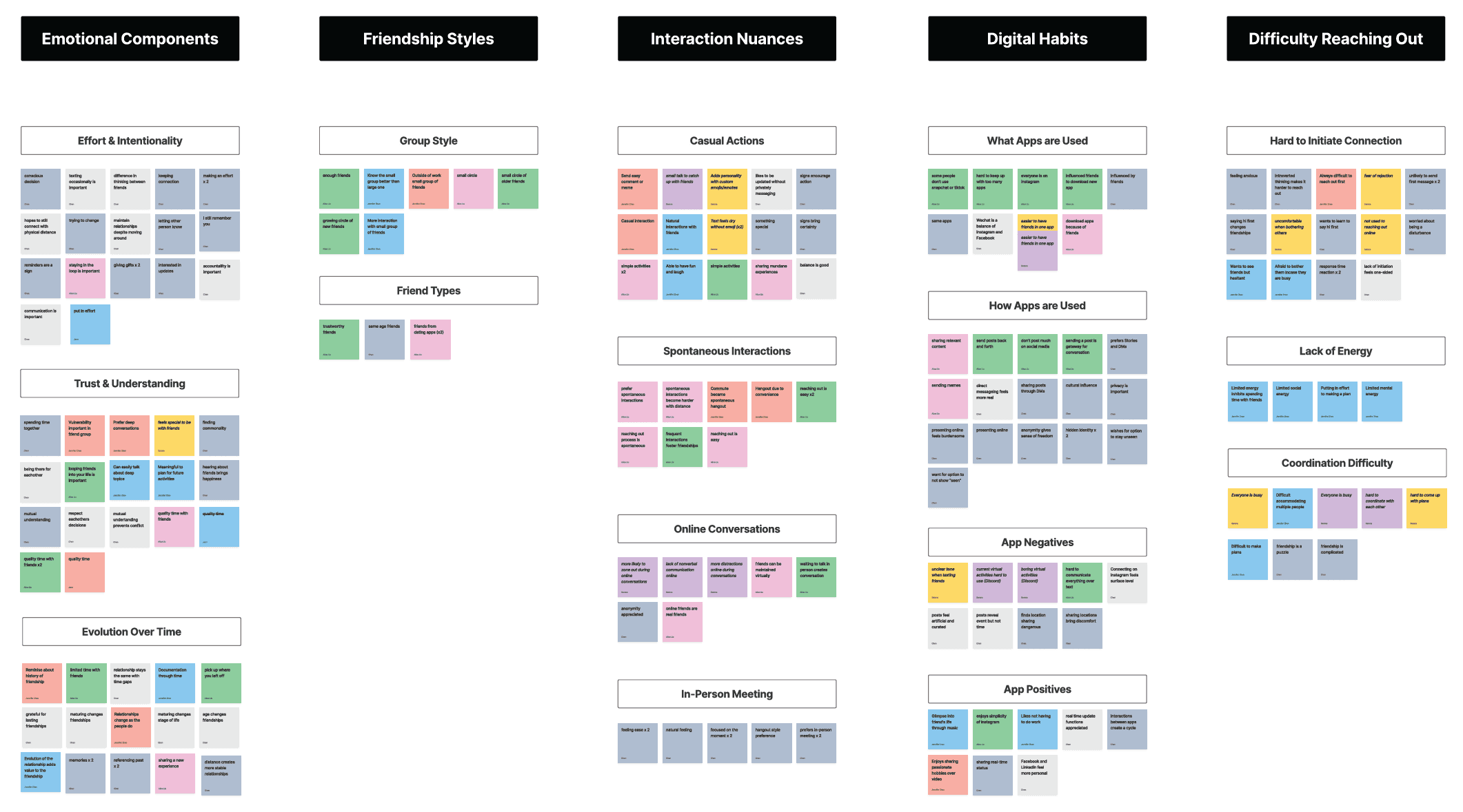
What we learned
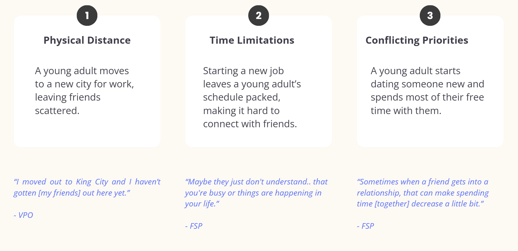
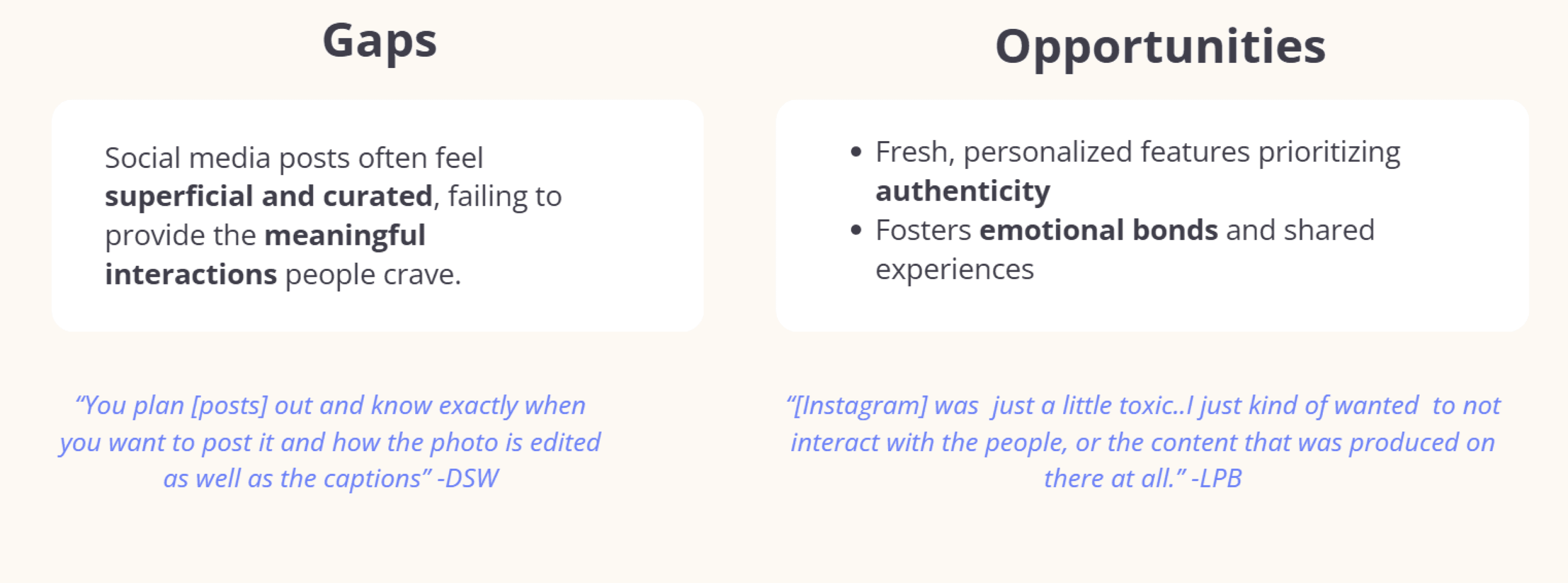
Main reasons why our participants struggle to maintain meaningful connections with their friends:
Key Insights
Friendships felt increasingly fragmented, yet participants deeply valued feeling “emotionally present” with close friends.
Many felt fatigue from performative or high-pressure social media.
The most treasured moments were often mundane parallels—like realizing you and a friend both made noodles that night.
To deepen our understanding, we analyzed existing tools, mapped out user journeys, and explored gaps in digital connection. These explorations seeded our design principle:
Enable casual but intentional interactions that foster emotional closeness, without demanding time or performance.
Product Research
To bridge our research findings with actionable design directions, we dove deeper into the ecosystem of existing digital tools. We analyzed popular social platforms like Instagram, BeReal, and Snapchat, alongside more niche tools like Locket and Vibes, identifying how they facilitated (or failed to facilitate) emotional connection.

While some apps offered ephemeral sharing and others leaned into habitual engagement, few prioritized authentic, low-effort intimacy—especially for close, long-distance friendships.
We synthesized this comparative analysis into a set of opportunity areas:
Less Performance, More Presence: Users were craving connection without the pressure of “posting for an audience.”
Casual Rituals: Tools that encouraged repeated small actions (like BeReal) helped form habits—but often lacked emotional depth.
Time-Independent Touchpoints: Asynchronous platforms like Slowly showed promise, but often felt too slow or impersonal for real-time friendship.
User Journey
Grounded in our research insights, we crafted a user persona to reflect the needs, goals, and behaviors of our users.
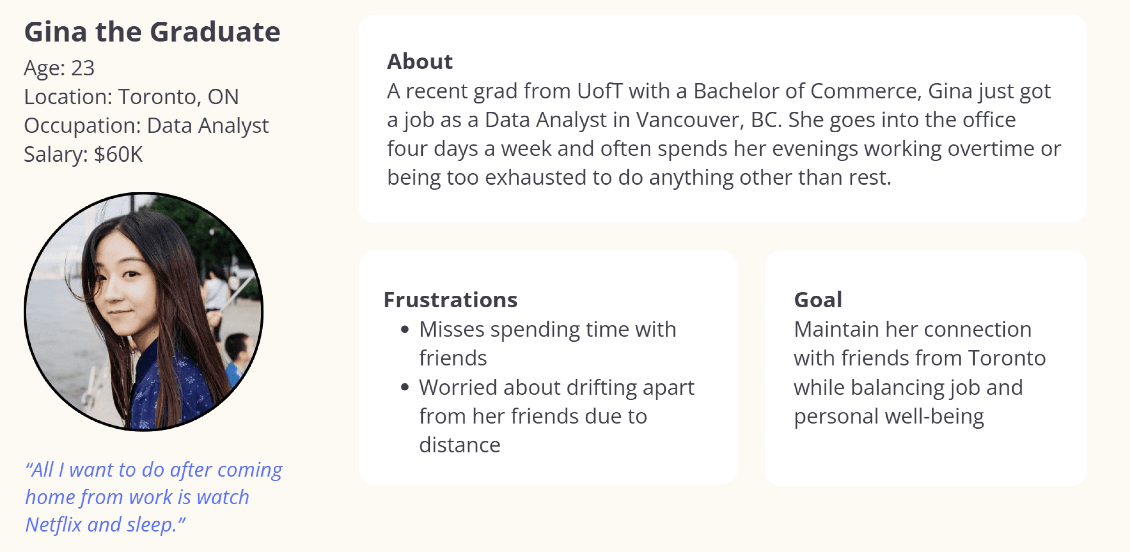
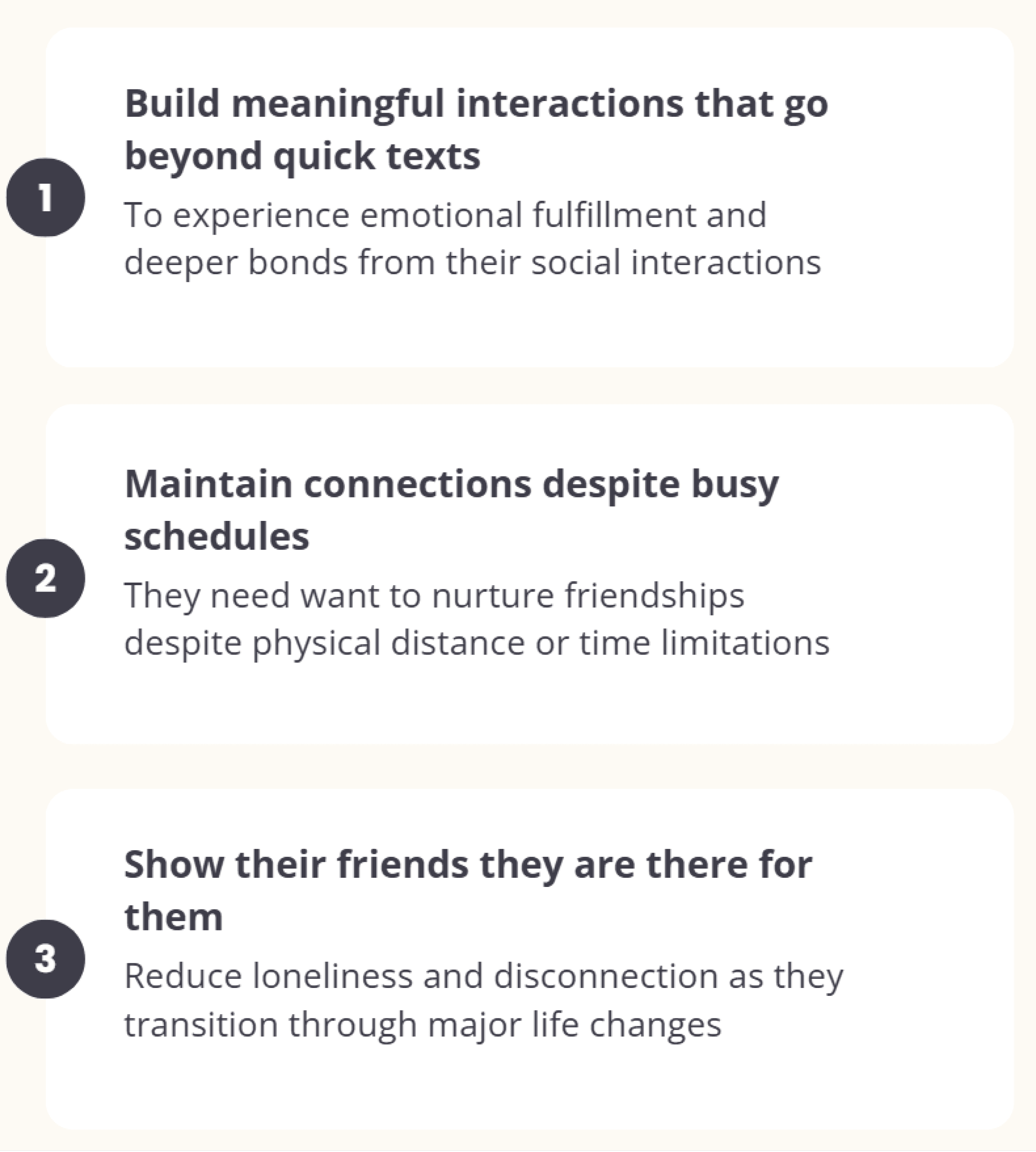
Like Gina, our users want to:
To visualize our users’ current pain points, we built an As-Is Journey Map, capturing the fragmented and sometimes disheartening experience of trying to stay in touch while busy. From missed texts and forgotten DMs to emotional burnout from scrolling, we saw clear friction between intention and reality.

This phase helped us clarify what kind of tool LuminUs could be:
Not just another messaging app—but a gentle invitation. A way to notice the parallel rhythms of life with someone you care about, even when you're apart.
Design Evolution
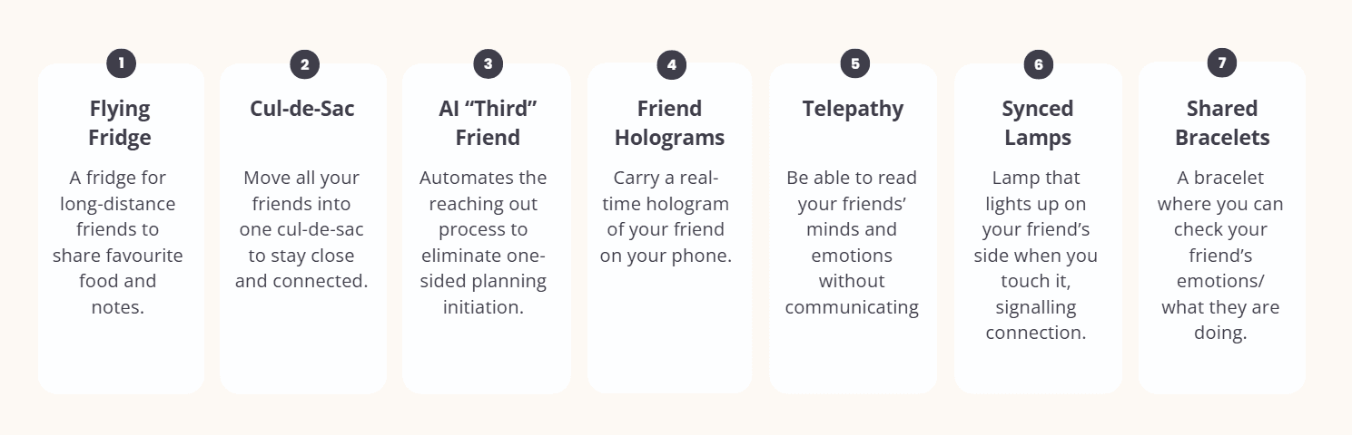
From our first brainstorming session, our bold, impromptu ideas ranged from practical solutions to imaginative visions beyond reality - all organized into this prioritization chart.
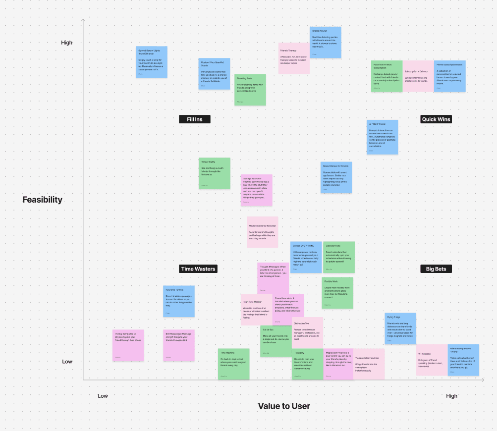
We explored multiple concepts—from a livestreaming cul-de-sac to physical mailbox metaphors. Early usability testing revealed that high-effort or synchronous designs created pressure—contradicting our goal of ease. With each cycle of ideas we worked through, we dug deeper to reflect on what each "feature" aimed to achieve, filtering out the points of potential we can take moving forward.
Usability Testing
To ensure our design direction aligned with real user needs, we conducted usability testing on our mid- and high-fidelity prototypes. This included:
2 rounds of user testing with participants who matched our target demographic
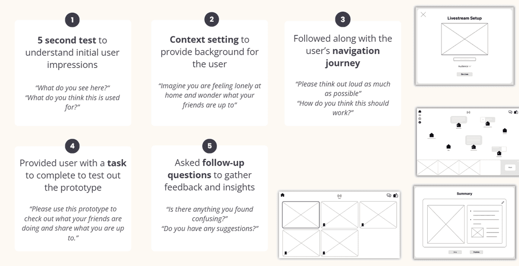
Expert feedback from instructors and design professionals during critique sessions

Self-guided re-evaluations to assess core goals

User feedback revealed friction points around features that felt overly synchronous or demanding—like our initial livestreaming concept. Participants expressed a desire for interactions that were low-pressure, flexible, and easy to incorporate into their daily routines.
Expert critiques further pushed us to refine our information hierarchy and streamline the prompt flow. These sessions also challenged us to articulate the emotional core of the product more clearly—leading us to re-center the design around the metaphor of fire and light as a grounding narrative.
Pivot Moment:
We returned to our core insight: meaningful connection can be as small as sharing a thought, a meal, or a mood. I led the concept refinement and initiated a new direction anchored in asynchronous, reflective prompts.
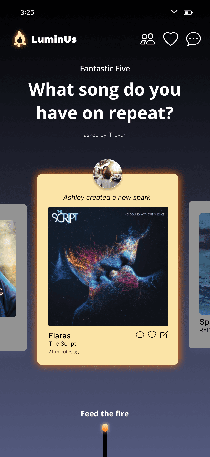
Final Design: LuminUs
LuminUs gently weaves shared moments into the rhythm of daily life.
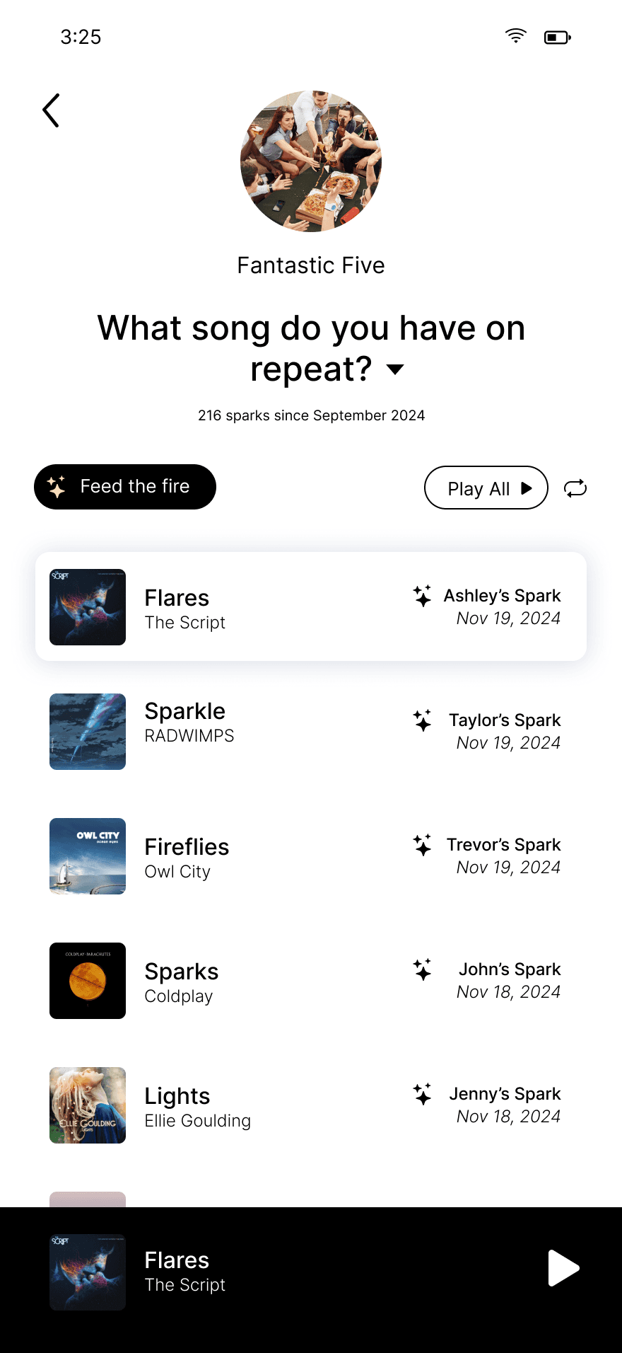
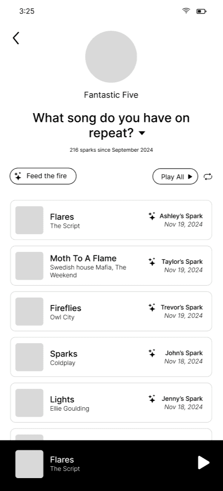
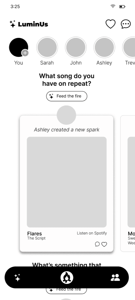
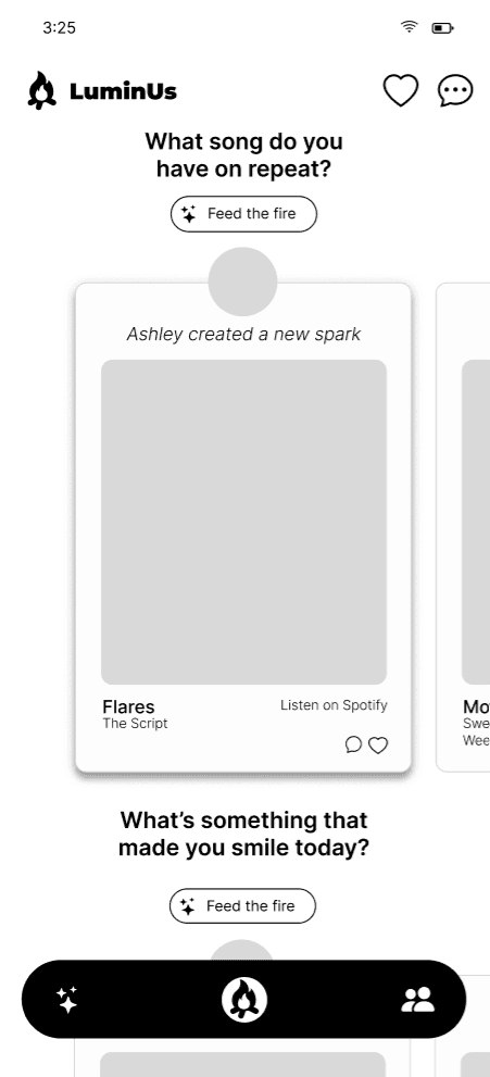
Through daily prompts, users share snapshots of their day—creating a shared emotional landscape with friends who may be far away.
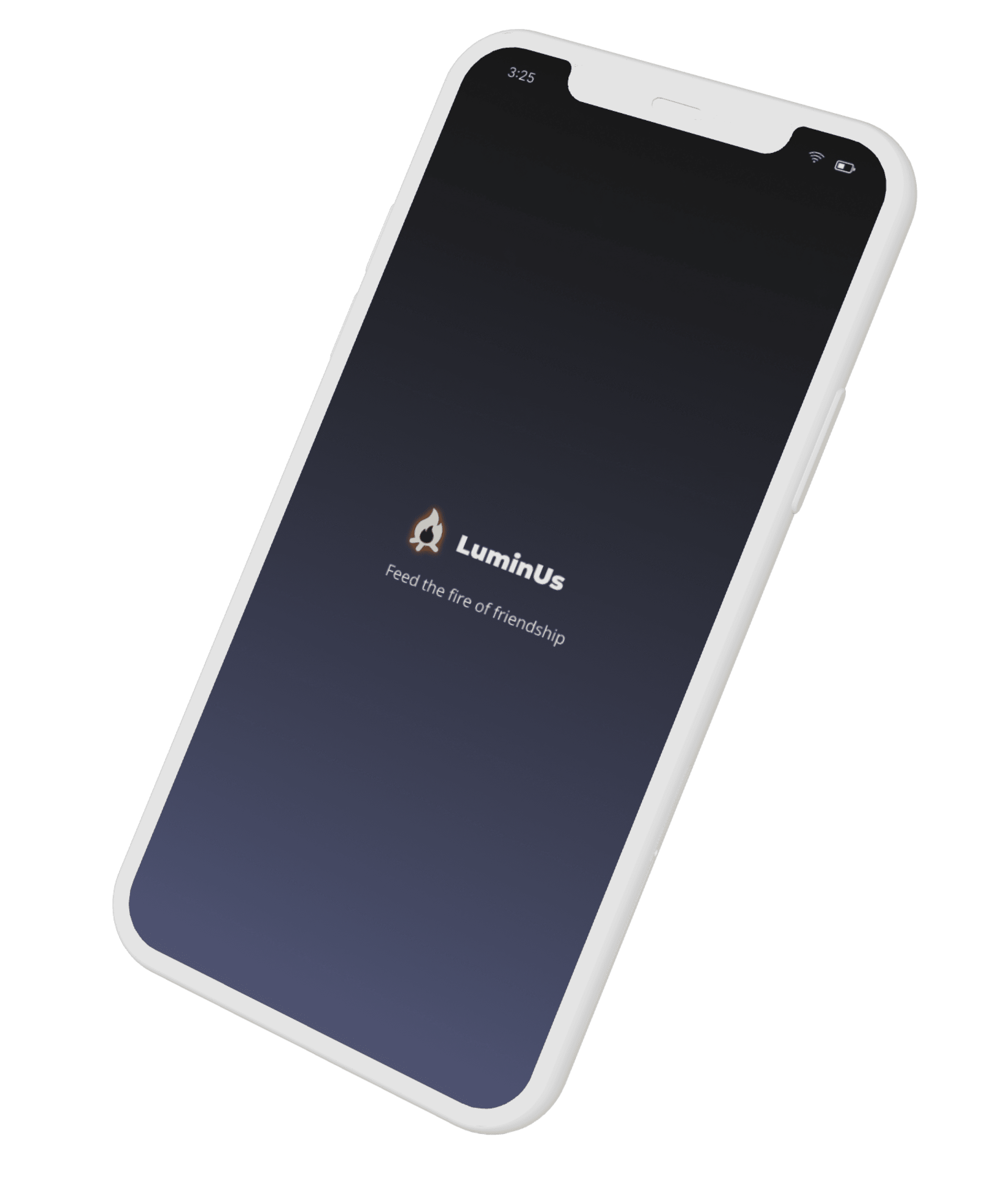
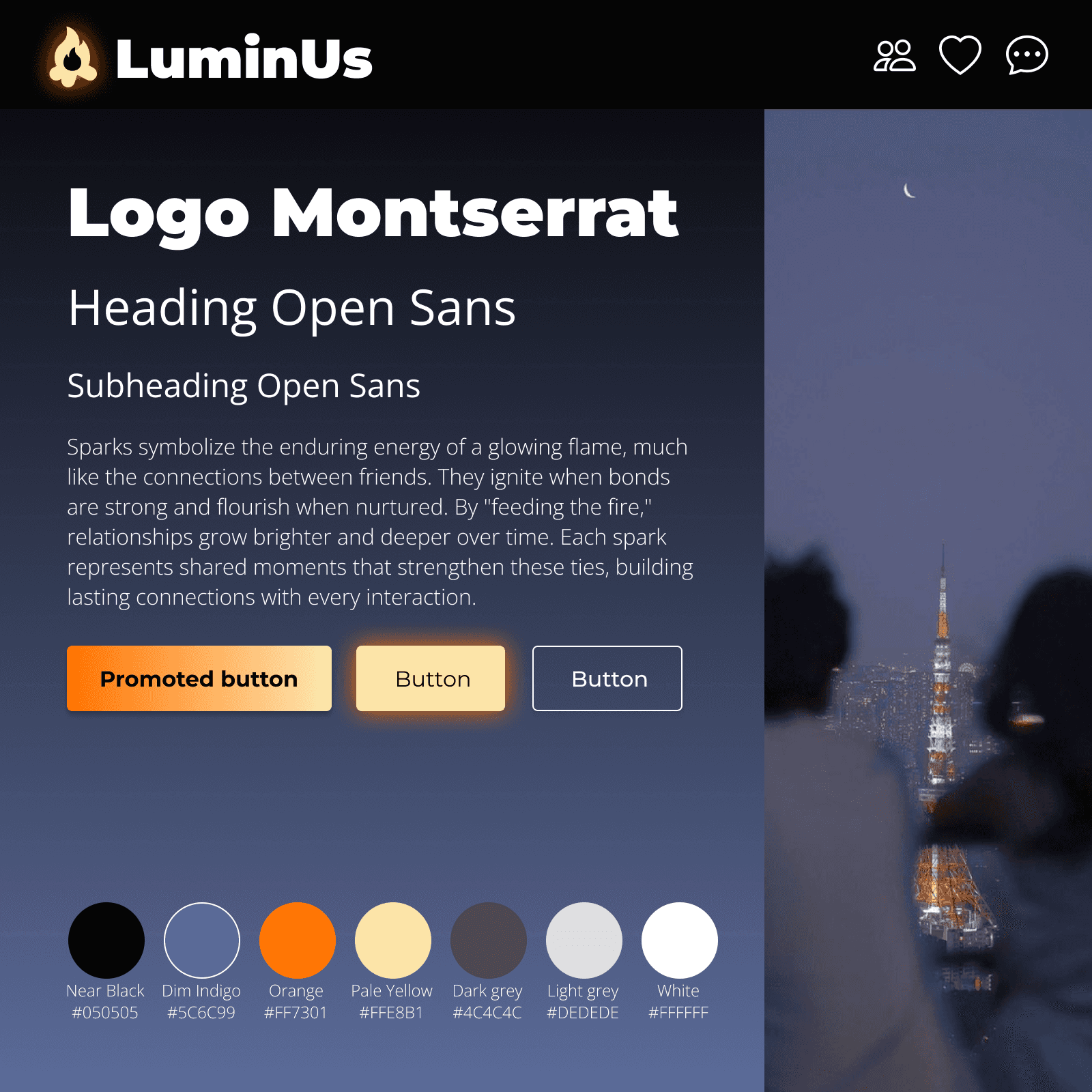
Fire as Metaphor:
Like sitting around a campfire, LuminUs fosters a sense of closeness and quiet connection. Flickering, fleeting—but warm and real.
Core Features:
Prompt-Based Sharing: Low-effort prompts spark thoughtful, personal exchanges.
Memory Calendar: A timeline of shared moments maps the evolving friendship.
Asynchronous Design: Removes pressure to respond immediately, respecting users' time.
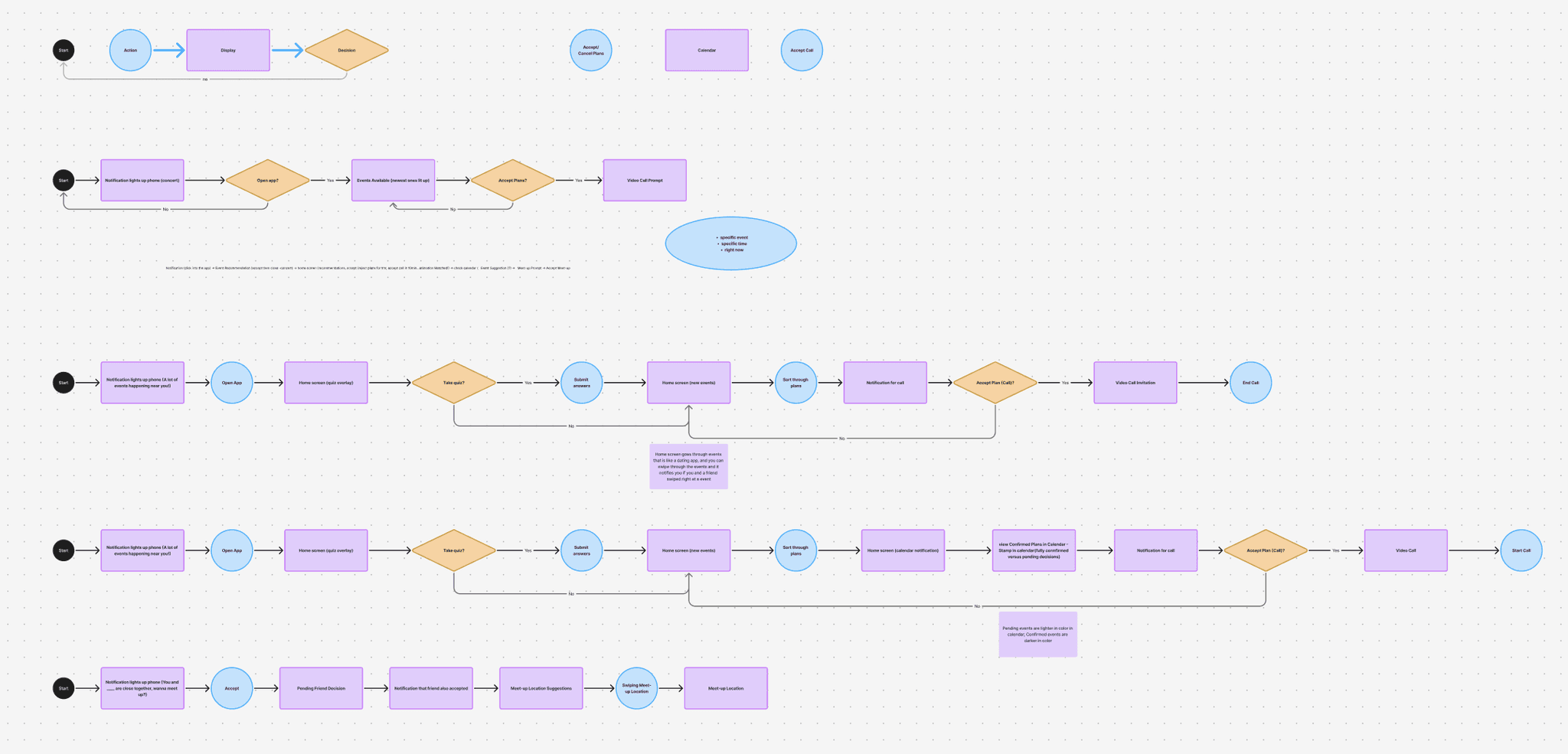
Design Process
Happy-paths
Wireframing
Rapid prototyping
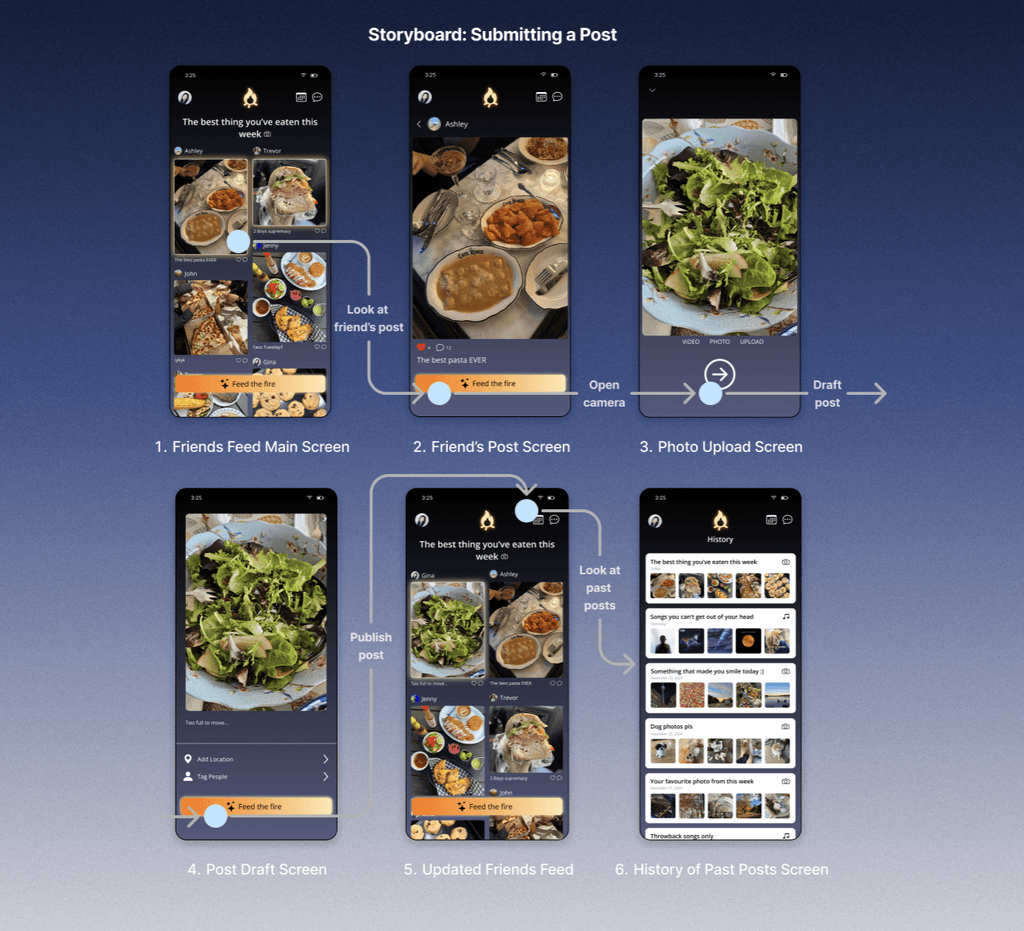
Storyboard
Visual & Creative Direction
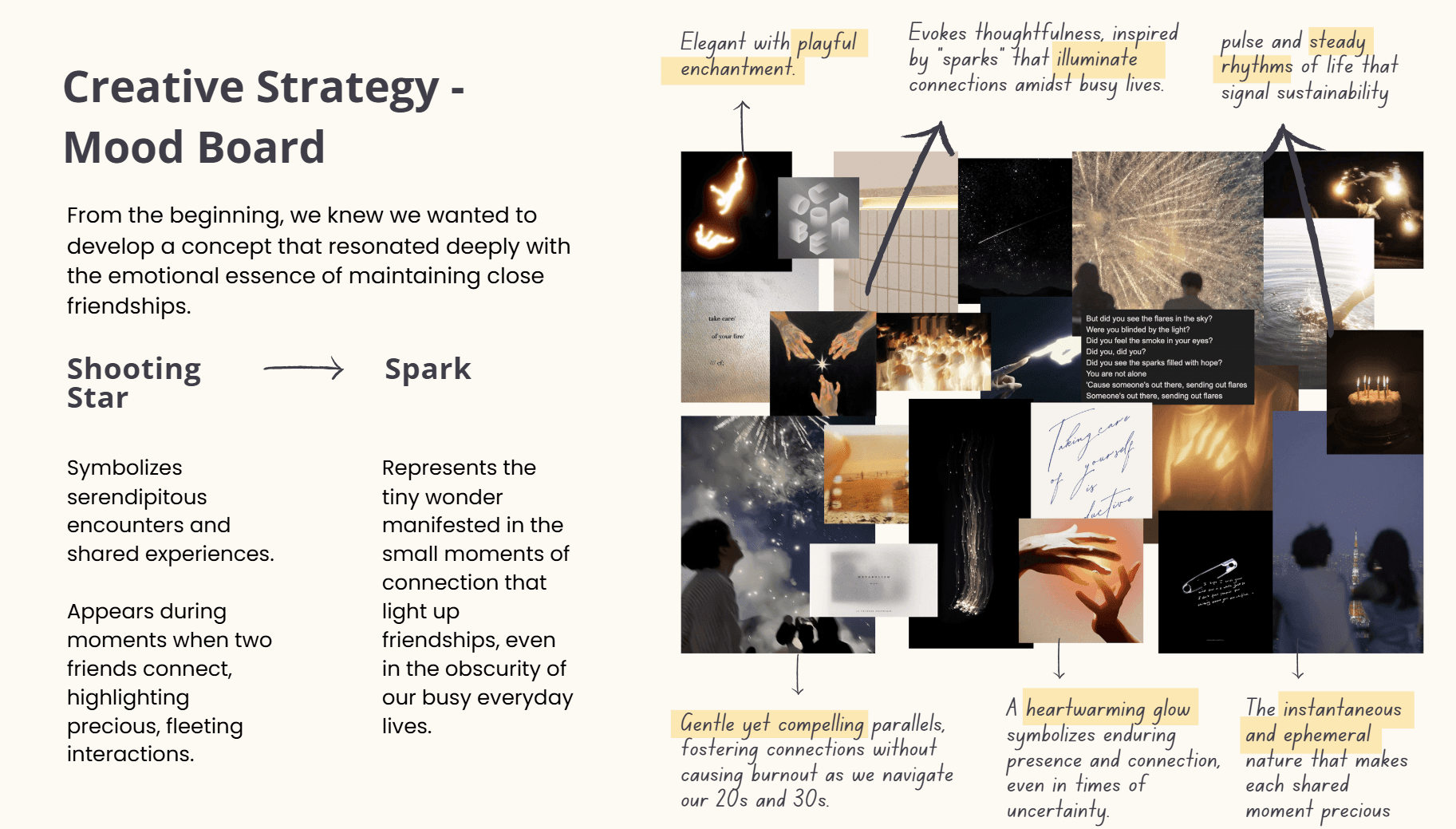
As the product’s tone solidified, I led the development of our visual identity and creative direction. I curated a moodboard around warmth, quiet joy, and emotional resonance. The UI design blends softness and clarity, mirroring the app’s intention: to feel like a spark in your day, not a task.
Afterglow: What Stuck With Me
This project taught me the power of designing for presence, not performance. We challenged assumptions about what "connection" should look like—moving away from notifications and timelines toward moments of meaning.
As our project took on a multitude of drastically different phases, I found our design evolution critical in shaping my understanding of iteration as a tool for empathy. I realized that letting go of early ideas wasn’t a loss, but an evolution—each test was an opportunity to return to our users with sharper focus and greater clarity.
Personally, I grew immensely through:
Leading concept pivots grounded in research
Synthesizing feedback into actionable design shifts
Developing thoughtful, metaphor-driven narratives
Most importantly, I learned that impactful UX design balances emotional resonance with everyday usability. LuminUs isn’t loud or fast—but it lingers.