
Motivating Young Ontarians to Vote
Elections Ontario Case Study - In Collaboration with the Elections Ontario App Team


Overview
In response to declining youth voter turnout in Ontario, our team was tasked with identifying and addressing barriers within the provincial voting experience. The goal was to improve the Elections Ontario (EO) app through human-centered service design that better engages Millennial and Gen Z electors.
As part of a graduate-level UX course led by a professor who works at Elections Ontario, our team was challenged to redesign aspects of the provincial voting experience using the EO app. We presented our final service design proposal directly to the Elections Ontario team responsible for the app.
Our five-member team brought together expertise in UX design, user research, and graphic design—with several of us also bringing prior experience working in the public sector.
My Role
UX Designer, Visual Strategist — user interviews, service mapping, interaction design, graphic designer and stakeholder communication.
Team
Chen Tong
Dan Chen
Yiting Shu
Olya Jaworsky
Xuefei Ma
Timeline
2 Weeks
Solution Preview


Problem Definition
Despite having access to digital tools like the Elections Ontario app, young voters (18–34) continue to be underrepresented in provincial election turnout.
We began with a simple yet revealing insights from interviewing Ontarian youth, EO staff and desk research:
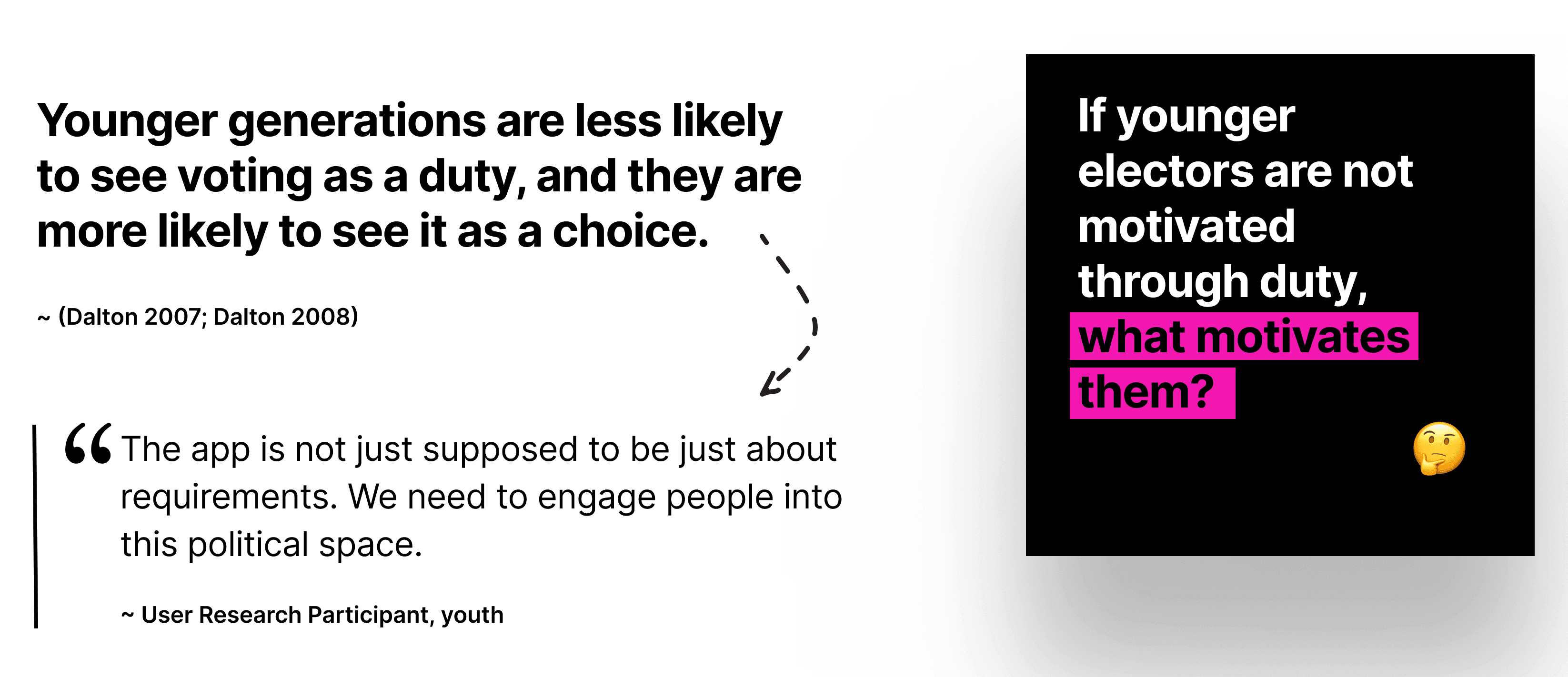
We found that while older voters often view voting as a civic duty, younger generations see it more as a personal choice.
So, we refined problem definition:
How might we design a solution that:
engages younger generations politically,
removes friction in the provincial voting process,
and supports EO’s mission of an accessible, efficient electoral process?
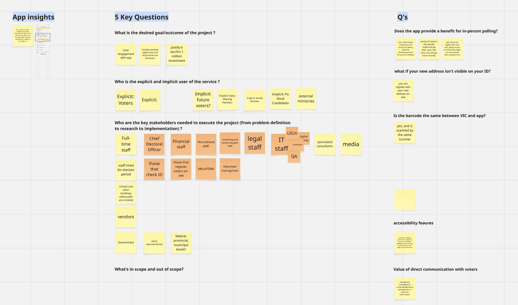
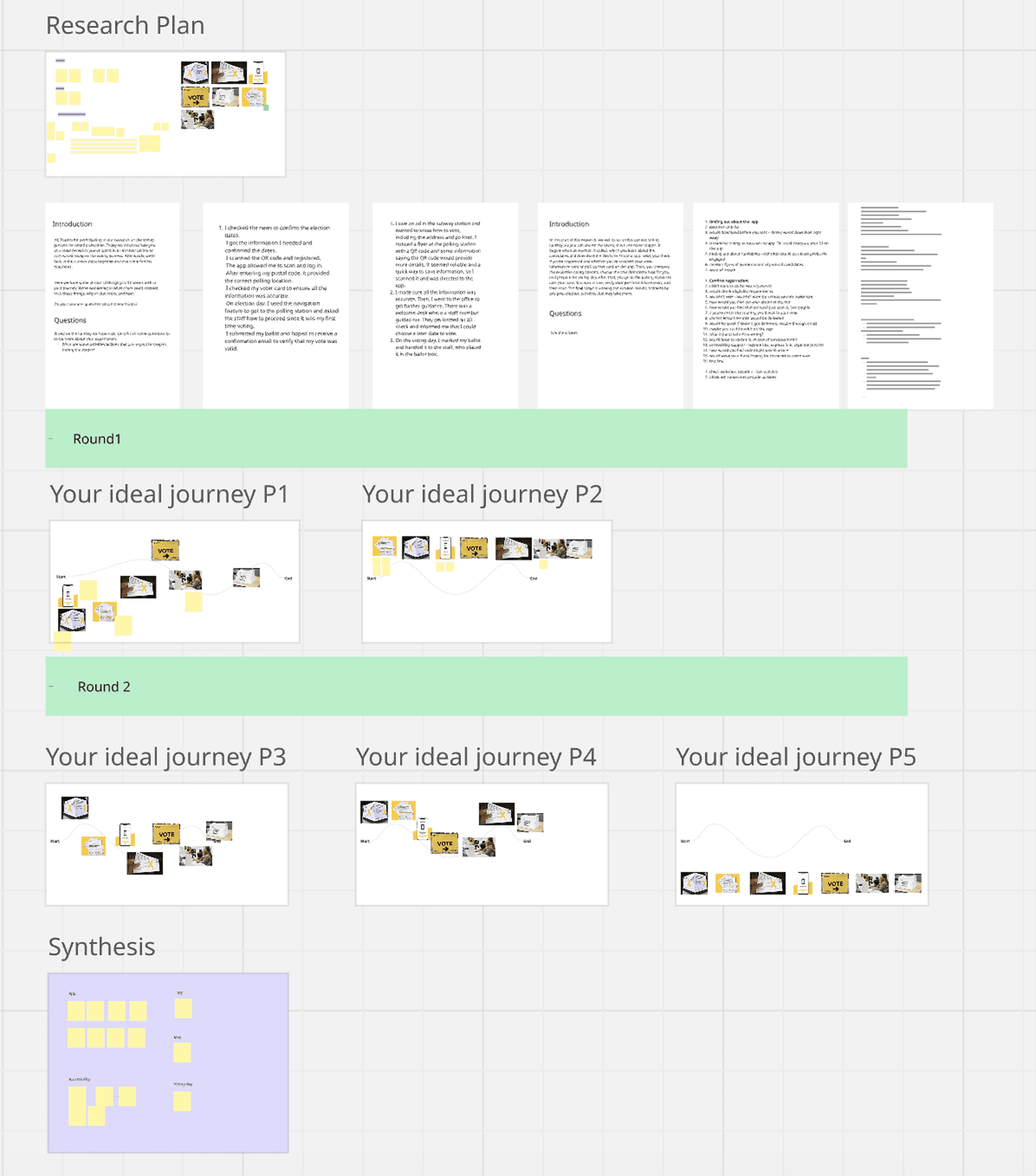
Research Process
Methods
Stakeholder interviews with EO staff
Semi-structured interviews with Gen Z and Millennial electors
Service blueprinting & outcome mapping
Desk research on electoral trends and social behaviors
Tools
Miro (Service Maps, Research Synthesis)
Figma (Prototypes)
Paper Prototypes & Storyboards
Semi-structured interviews with Gen Z and Millennial
Service blueprinting & outcome mapping
Synthesis and Storyboarding
Design Strategy
Key Insights
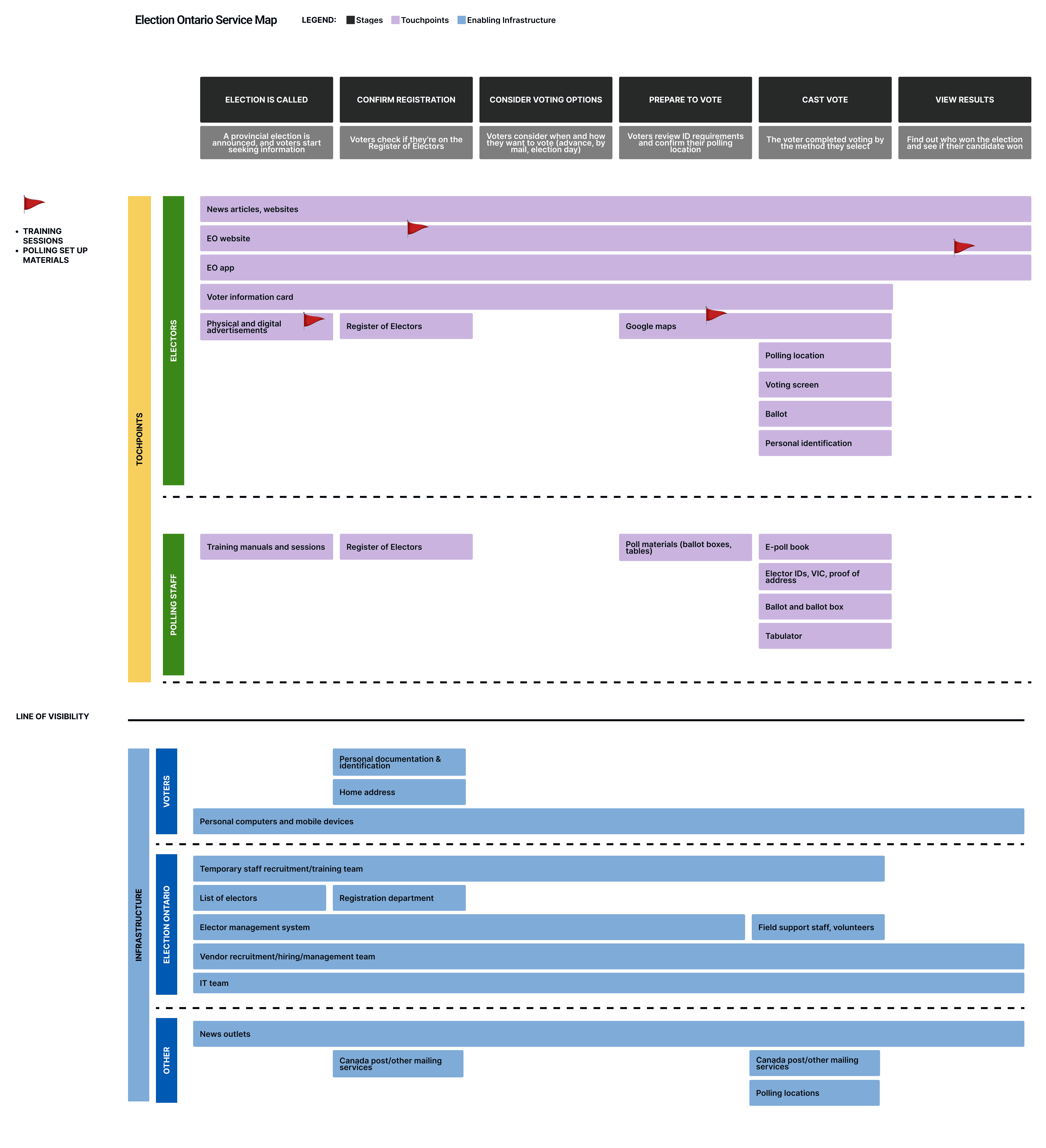
From analyzing recurring points of friction in the electors' voting experience, we highlighted key moments of opportunity for our team to improve.

Information gaps: Many first-time voters didn’t know if they were registered or what ID was valid.
Emotional disconnect: Users described the process as “flat” and “boring,” with little sense of personal relevance.
Social proof matters: Voting behavior is socially contagious — users are more likely to vote if peers are doing so.
Digital dissonance: EO’s current digital presence feels impersonal and transactional to young users.
Our 2 Integrated Service Design Solutions
We proposed two integrated service design solutions, each addressing distinct pain points while working together to build trust and momentum.
Solution
Objectives
Metrics
#1 Personal voting support to curate an efficient preparation plan
Increasing number of young app users (Millennials and Gen-Z)
Positive trend in total app downloads
Ratio of eligible voters to app users
App usage data by finction
#2 Increase political engagement through social motivators
Increase general political engagement in young electors
Increased voter turn out trend
Number of hared to social platforms through the app
Number of posts with #EO and tagging @EO on social media
Solution 1: Personalized Voting Support
A reimagined onboarding journey transforms the EO app from a static checklist into a personalized electoral guide.
Key Features
Quiz-based onboarding: Asking questions during onboarding to generate a personalized checklist that help voters stay on track throughout the entire process
Why this matters: 33.9% of young people under 25 said they didn’t vote due to “the lack of information, understanding, and knowledge”.

"I didn’t even know I had to update my registration if I moved."
– First-time voter
Guiding prompts at common confusion points: Contextual prompts and support links are embedded throughout the experience to proactively address frequent areas of confusion
Interactive checklist: Displays dynamically-updated next steps—registration, ID prep, polling station directions.
Why these matter: Elections Canada’s survey discovered that fewer young people vote because they “perceived the voting process as too difficult”.
Real-time wait times: Crowdsourced and data-fed estimates help electors plan better on voting day.
Why this matters: One of the top 3 challenges our interviewees cited in voting was time-related conflicts with their busy schedules

Digital VIC & registration confirmation: Secure, digital voter information card (VIC) and post-vote confirmation builds trust and clarity.
Why this matters: Elections Ontario staff shared that a major issue they face is making sure physical VICs are actually received by electors.
Common VIC-related issues:
Electors living away from their registered primary residence
Electors losing or forgetting their VIC
VICs getting lost in the mail

Solution 2: Social Engagement Layer
By integrating light social features, the EO app can shift voting from a private task to a shared cultural experience, Making voting visible, relevant, and community-driven.
These interactive features aim to make the voting experience more public, social, and rewarding, especially for first-time and Gen-Z voters.
Research shows that peer influence is more effective than information-only campaigns in boosting voter turnout — by as much as 2.08% in digital experiments.
Key Features
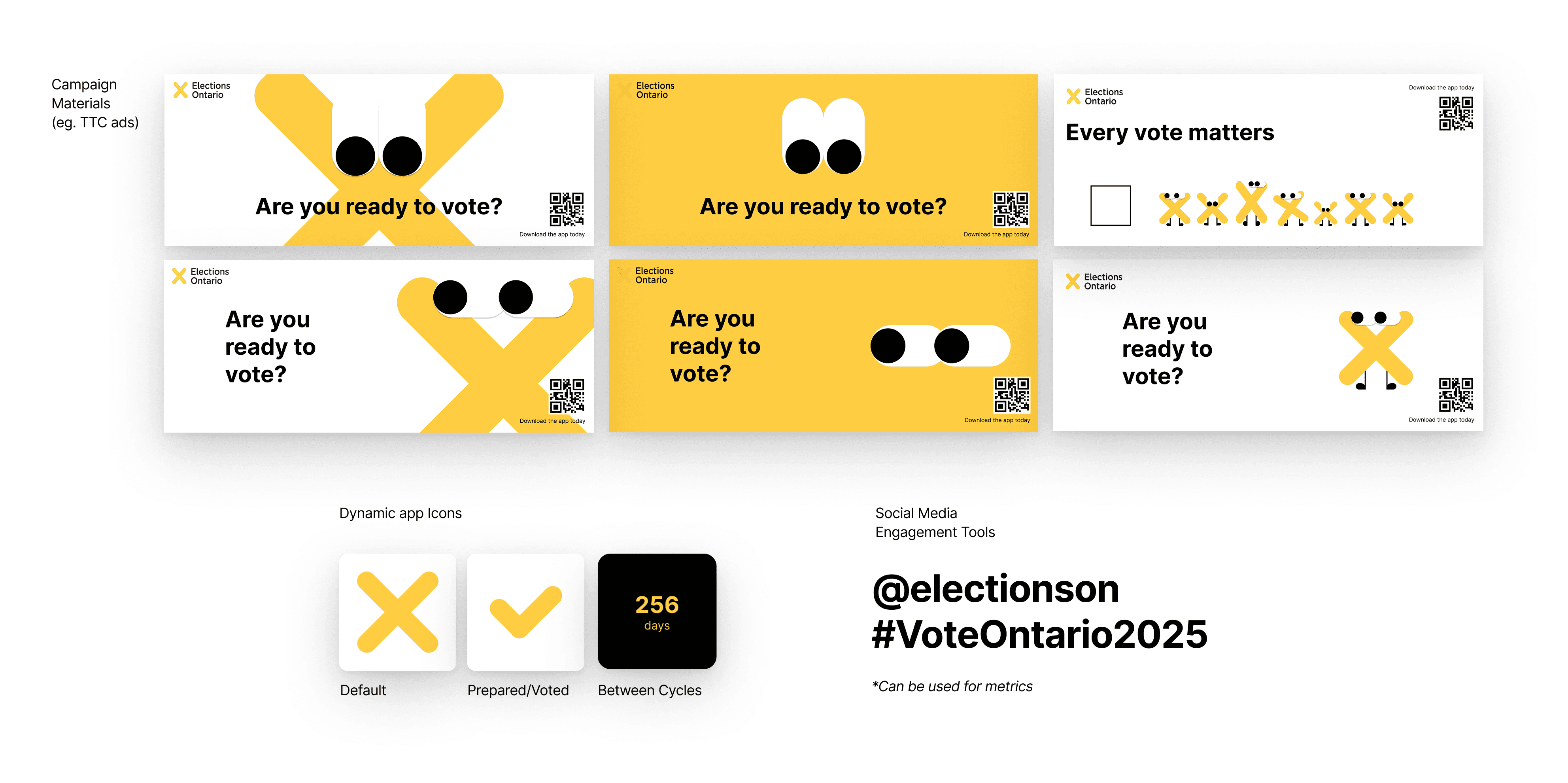
“I Voted” Social Share: Allows users to post a custom badge or animation after voting.
Why this matters:
73% of people feel more informed through social media (Pew Research).
Gen Z views voting as a choice, not a duty (Elections Canada).
This moment of visibility makes voting feel recognized, celebrated, and part of their online identity.

Voting is important, but the experience feels so flat. I wish the app made it more engaging or gave me something to share.”
-Young Elector
Interactive Turnout Map: Real-time, tappable heat map shows voting activity across regions, giving users a sense of collective participation.
Why this matters: Beyond just data, this map makes polling activity feel visible and alive. It turns abstract numbers into something digestible and meaningful — helping electors see where they fit in.

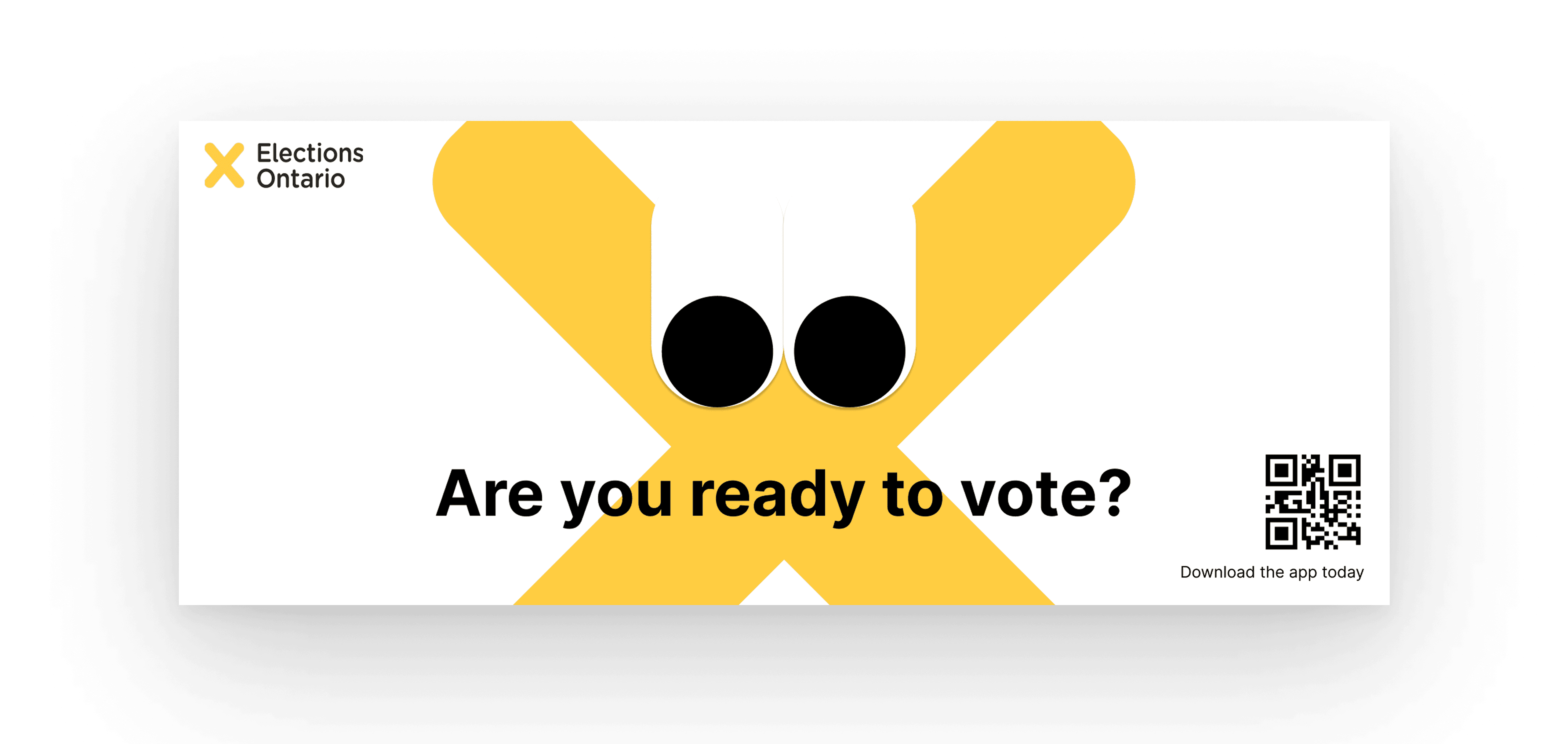
Mascot-Driven Awareness Campaign: A playful ‘X’ character represents electors and appears in TTC ads and on social media to draw attention in a lighthearted but meaningful way.
Why this matters: "Voting is Contagious"
Studies show that individuals are more likely to vote if they see social messages from friends encouraging voting, or if they are surrounded by peers who vote, compared to if they received purely informational messages encouraging them to vote with impersonal details such as location
User Experiece Storyboard - Integrated Solutions
We mapped out the redesigned EO journey from pre-election awareness through post-vote feedback:
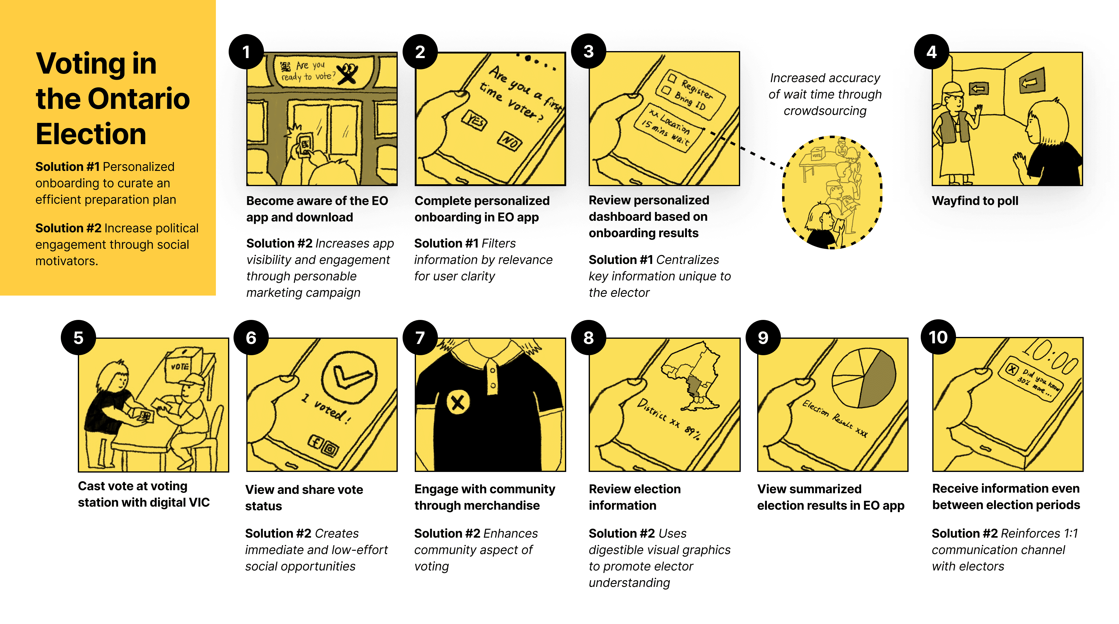
Storyboard Walkthrough
Awareness
TTC posters and social media ads featuring the mascot
QR code links directly to the app
Onboarding & Prep
Quiz-driven flow: “Are you registered?”, “Do you have valid ID?”
Personalized checklist appears on homepage
Voting Day
Wait times, directions, digital VIC
Confidence-boosting UI and real-time updates
After Voting
Instant confirmation and shareable “I Voted” badge
Regional turnout map reinforces engagement
Results and civic content between cycles
Risks & Mitigation
Risk
Mitigation
Social features may not yield measurable engagement
Pilot hashtags & shareables before full rollout
Public trust in EO must be maintained
Avoid gamification; focus on informative and civic-oriented messaging
System load during peak use
IT team tasked with load testing and phased feature releases
Rollout Plan
Our implementation strategy is phased to ensure technical feasibility, stakeholder alignment, and user impact. We prioritized features that address the most pressing barriers for young voters—lack of time and limited understanding of the voting process.
By introducing this service in stages—from friction-reduction to ongoing engagement—we aim to shift voting from a one-time task into a recurring, meaningful civic habit. Each phase strengthens Elections Ontario’s digital ecosystem while aligning with its core mission: an accessible, efficient, and informed electoral process.
Phase 1: Core Feature Integration & Awareness Campaign
Focus: Reducing friction and improving clarity for first-time and young voters.
Step
Roles Involved
Personalized Quiz Onboarding
A dynamic quiz helps voters assess eligibility, registration, and ID requirements, then generates a personalized to-do list.
• UX/UI Team: Designs interaction flow, tests onboarding clarity, and gathers user feedback.
• IT Team: Develops and tests the quiz engine to ensure scalability under peak loads.
Brand Awareness Through Mascot & Campaign Assets
A friendly ‘X’ mascot featured in TTC posters and digital ads helps Elections Ontario feel more approachable.
• Short-term vendor partnerships update visual assets.
• Poll station staff manage on-site QR codes to encourage app downloads.
Phase 2: Engagement & Real-Time Feedback Loop
Focus: Building trust and social visibility.
Step
Roles Involved
Social Sharing & Voter Confirmation
Electors receive a shareable “I Voted” badge post-submission to encourage peer participation.
Interactive Turnout Map
Real-time, regional heat maps visualize turnout data in a relatable way.
Checklist Follow-through
The personalized checklist persists through voting day to reinforce voter confidence.
Operational Planning
• PM Team: Oversees iteration planning based on user behavior and survey feedback.
• IT Team: Begins infrastructure upgrades for future live status features.
Phase 3: Infrastructure Expansion & Long-Term Engagement
Focus: Sustaining engagement and building voting as a habit.
Steps
Live Wait Times & Status Updates
Real-time polling station data will be phased in after load testing is complete.
Open Data & Public APIs
Accessible dashboards and APIs foster transparency and allow civic tech integrations.
Personalized Nudges
Smart notifications and trivia (e.g., “Why do we vote with pencils?”) keep users engaged between cycles.
After the Deadline: What this Process Taught Me About Design
Designing for Public Trust Means More Than Usability
This project exposed the complexity of designing for civic systems, where usability alone isn’t enough—solutions must also account for trust, equity, and long-term behavior change. We quickly learned that designing for public service means balancing user needs with institutional limitations, political neutrality, and technical constraints.
We had to confront the tension between innovation and credibility. While social media features offered potential to engage younger voters, we critically assessed their appropriateness for a public agency. This led us to position them carefully—as optional, lightly integrated, and grounded in evidence on social influence.
Navigating Scope Requires Constant Zooming In and Out
Early on, we underestimated the challenge of working across such a wide service ecosystem. The scope forced us to constantly shift focus—from detailed UI flows to high-level service journeys—which required a level of alignment we initially struggled with. Communication friction slowed us down, and our focus on efficiency sometimes came at the cost of clarity.
Confusion Isn’t Always an Interface Problem
We learned that users often weren’t confused by the design, but by assumptions baked into the voting process itself. Our most effective interventions—like the checklist and quiz—didn’t just streamline tasks, they clarified what users didn’t realize they needed to know.
Collaboration Is a Practice of Calibration
Our team brought a range of styles and strengths. Rather than rushing toward efficiency, we learned to calibrate—pushing and pulling where needed to let each person lead from their strengths. This flexibility made our collaboration not only smoother, but more intentional and resilient.
Good Service Design Is a Negotiation
By the end, we gained a deeper understanding of service design not just as a method, but as a negotiation—between users and systems, simplicity and nuance, vision and constraint. The process made us sharper, more adaptable designers, and reminded us that the most impactful solutions often start by asking the right questions, not assuming the right answers.